Opportunity
The Muse outgrew its existing visual identity and would benefit from a flexible design system that covered the needs across the entire company.
Problem
With the company’s growth, marketing material, editorial graphics, and individual products were becoming visually disjointed.
Solution
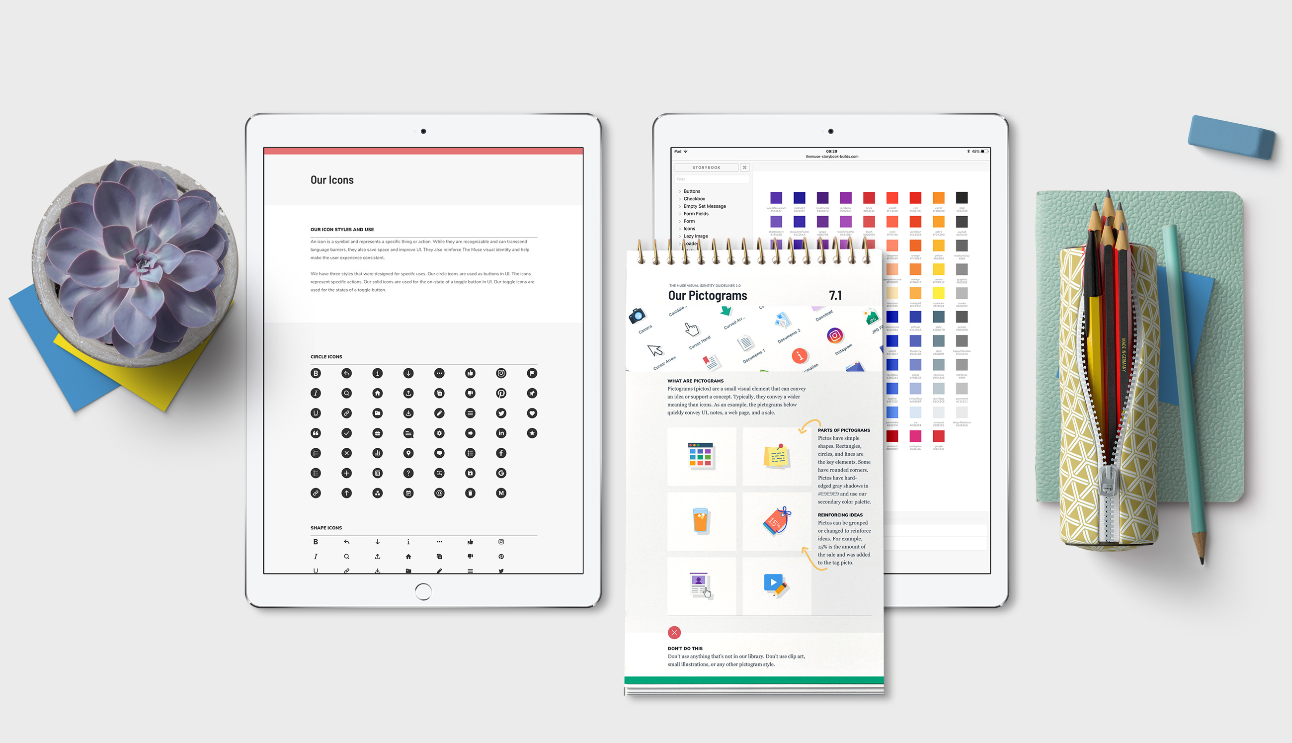
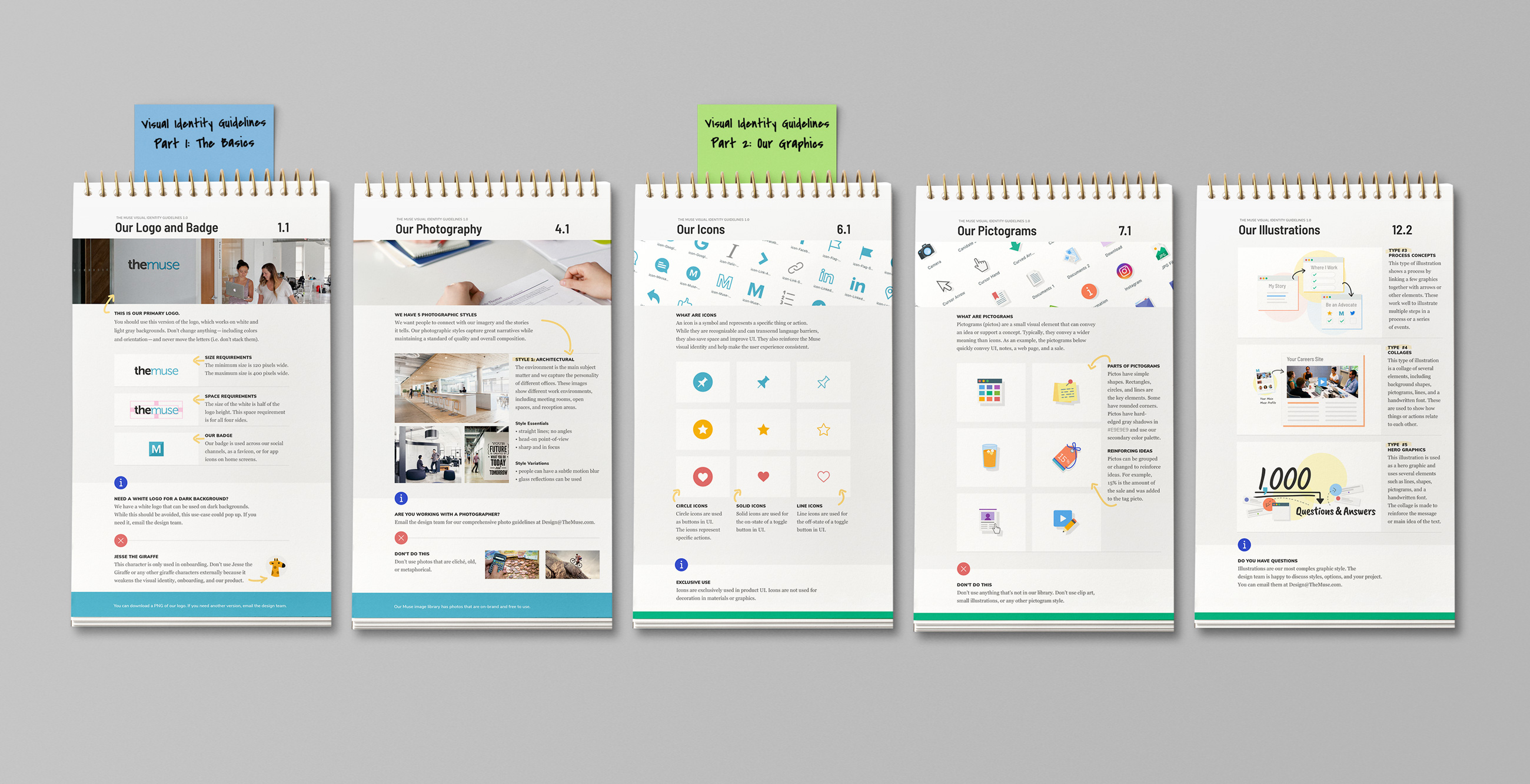
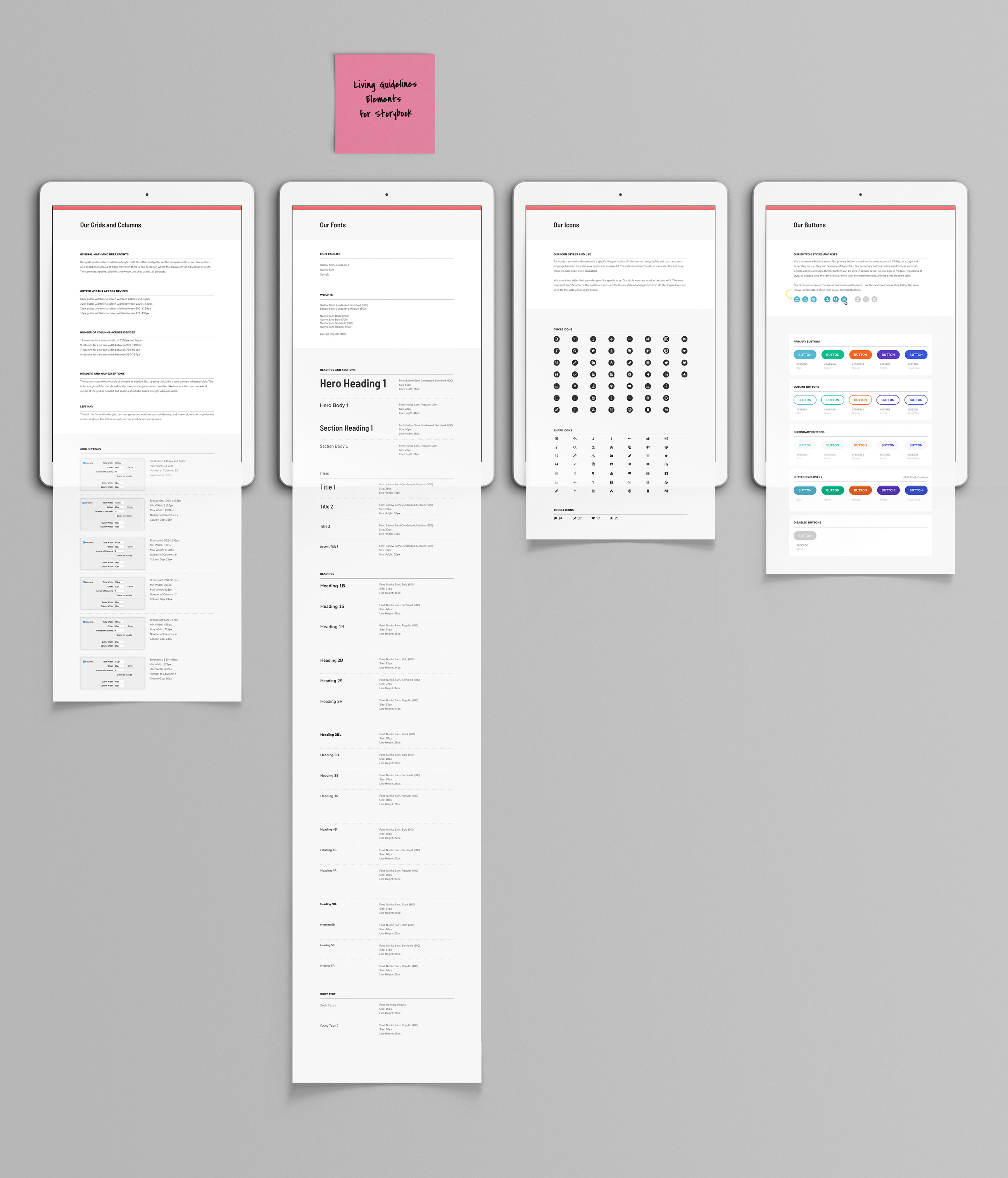
I created a more flexible system that covered the needs across the entire company. In addition to widening the color palette, I created a full suite of icons, pictograms, hand drawn elements, and a flexible illustration style. I also updated the fonts to complement the new look. Storybook was adopted and I worked with several engineers to add new styles and common UI elements.
Result
Once this was implemented, teams were able to bring consistency across products, graphics, and marketing material. Plus, engineering teams were able to build more efficiently.

