Opportunity
After running several small-scale trips, Atlas Obscura realized that it could grow this side of their business, both nationally and internationally.
Problem
When the business started to focus on trip sales, it became clear that users could not find and book a trip easily.
Solution
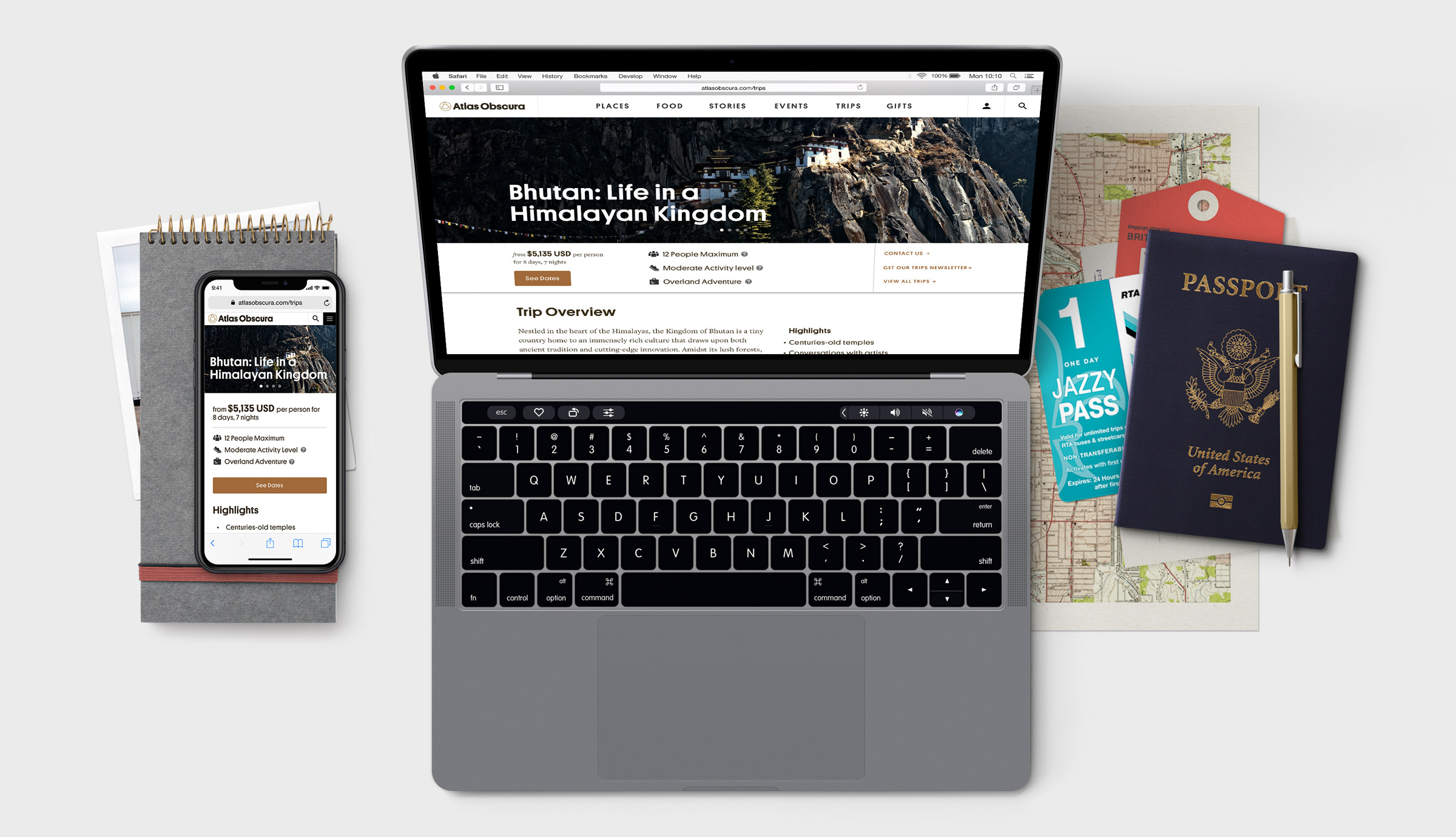
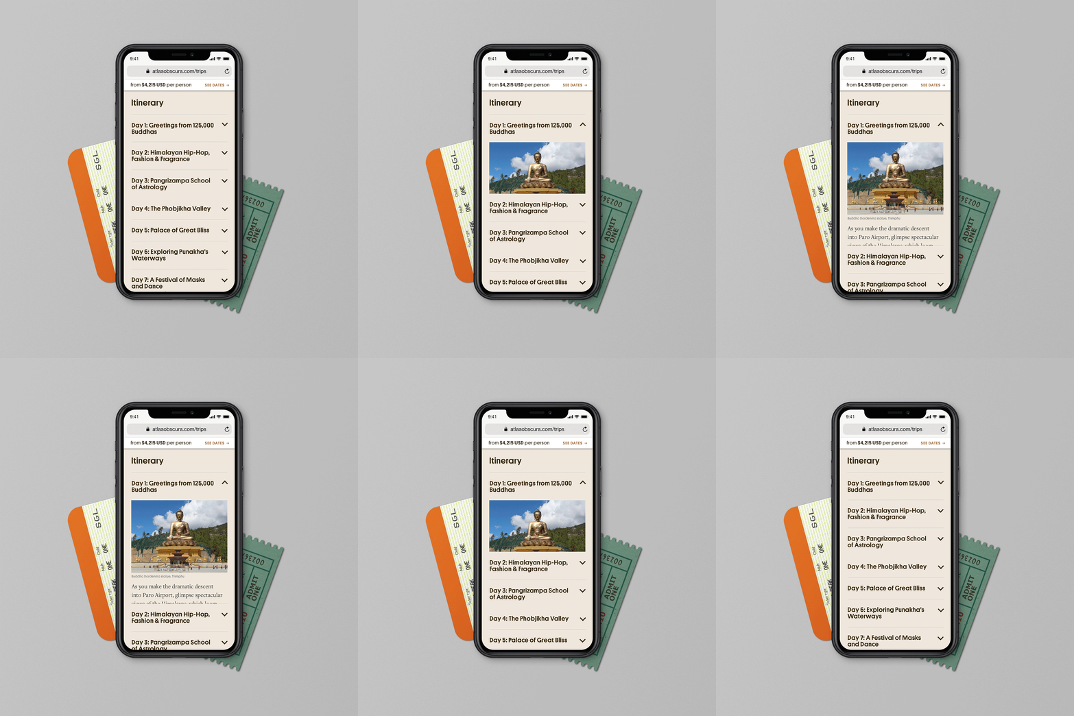
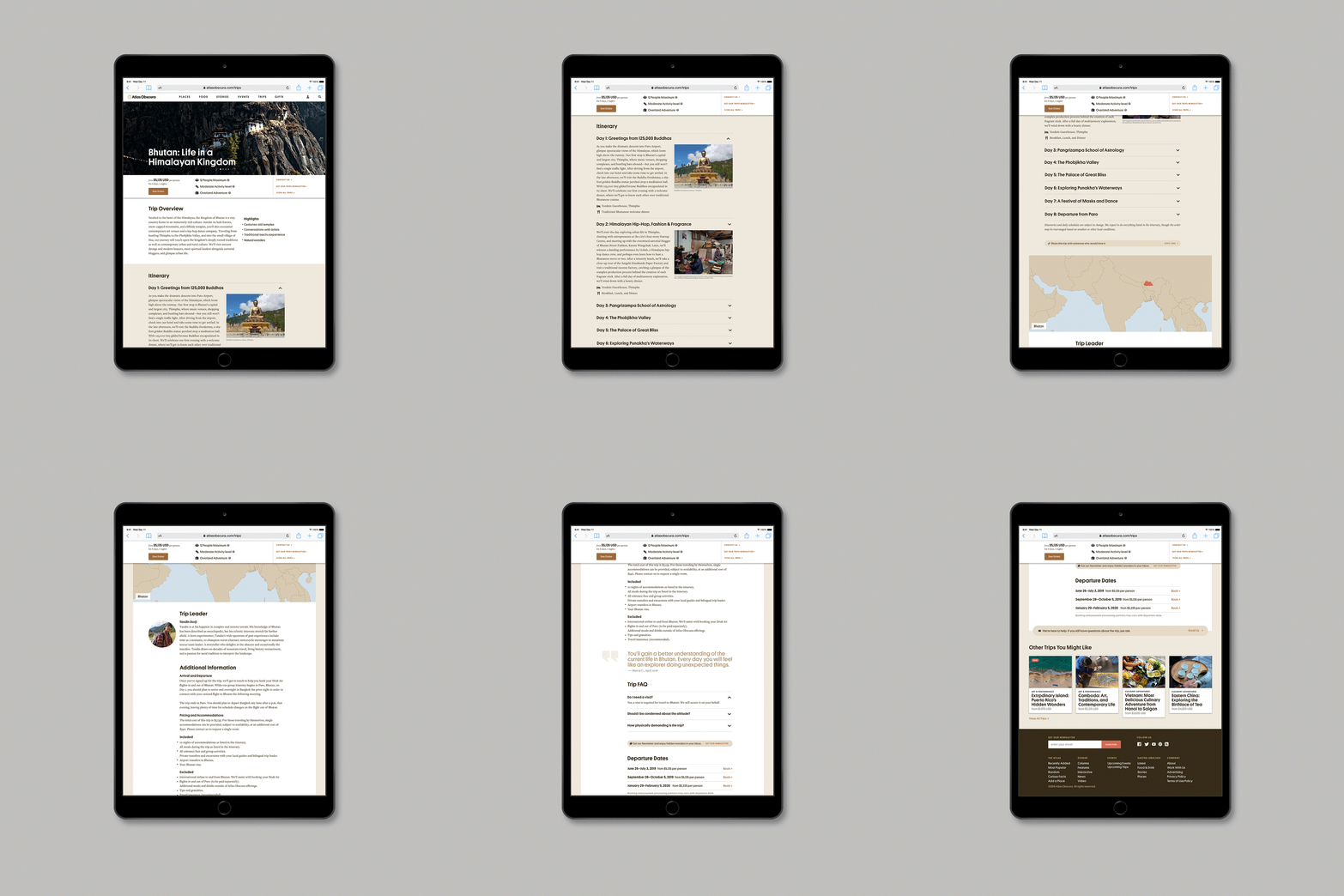
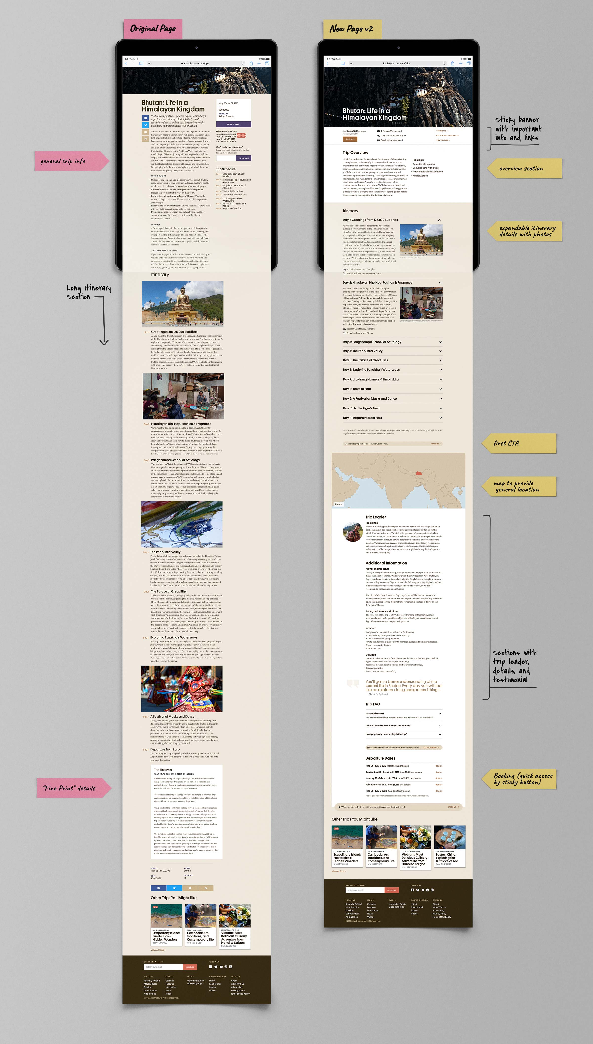
To get started, I conducted competitive research and a survey with current trip goers to find out what information was important when deciding to take a trip. Based on the results, I redesigned the trip detail page with a new hierarchy. In addition to the UX changes, the page needed to present a trip with multiple departures to reflect the new business model and operational changes.
Result
After lunching the new pages, the bounce rate was reduced by half and the time users spent on those pages doubled because engagement increased.


